Design Project
Salams App Rebrand
Project Overview
The Salams brand was long overdue for a refresh. Our visual language felt outdated, inconsistent, and no longer reflected who we were or where we were headed. There was no cohesive brand guideline, and with a small team, decisions were often made on the fly resulting in a mix of styles and messages that lacked clarity and cohesion.
We needed to modernize the look and feel of Salams in a way that aligned with our mission: to build a platform rooted in community, sincerity, and positivity. This meant crafting a more youthful, thoughtful, and welcoming identity that could flex across marketing, product, and social channels without losing its soul.
From rethinking our core values to setting new visual standards around type, color, and content tone, the rebrand created a foundation we could build on with intention.
My Role: As the lead designer on this project I
Designed the visual identity system (colors, typography, layout, and tone)
Led internal workshops and brainstorming sessions to align the team on our brand voice and values
Created clear brand guidelines for influencers, designers, and cross-functional collaborators
Rolled out the new brand across social media, in-app events, and marketing graphics
Advocated for brand consistency and served as the go-to person for brand guidance when new campaigns or assets were being developed
Team: CEO, Marketing Manager, Marketing Director and Videographer
Tools: Figma, Adobe Illustrator.
Brainstorming / Comparative Analysis
Before jumping into a full rebrand, I spent time looking at what others in the dating space were doing, from mainstream apps like Bumble and Thursday to more niche ones like Muzz. I wasn’t just studying fonts and colors (though those mattered!) I was really paying attention to tone, vibe, and how each brand made users feel. What stood out was how clear and consistent their branding was; even when the content was casual or messy, the voice held it together. Compared to that, Salams felt a little scattered. We had warmth and heart, but no strong visual system to anchor it. That became the starting point:
How do we keep our sincerity, but show up with clarity?
How do we build trust in a skeptical space—while still feeling fun and inviting?
And more importantly: What kind of brand actually looks like that?

To start shaping that answer, we brought it back to the team. Before diving into any visuals, we ran a quick internal workshop and asked:
"What does Salams look like to you?"
"If it were a person, how would it talk? How would it make you feel?"
The goal wasn’t to land on a perfect aesthetic, but to gather raw thoughts and gut feelings from the people who knew the brand best. That gave us a foundation in how we perceived the brand. and how we wanted others to perceive it. Here's a peek at that process:
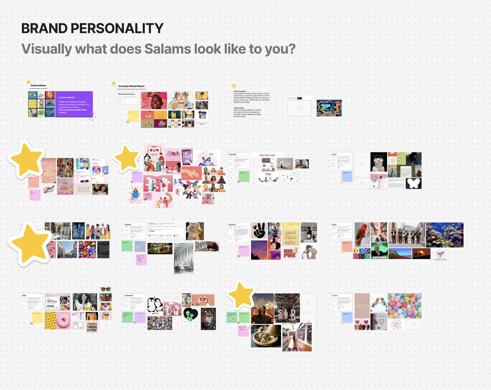
After reviewing brand tone examples and reflecting as a team, we aligned on what we wanted Salams to feel and look like going forward: positive, joyful, immersive, and inclusive wrapped in a look that felt modern and unified.
We then landed on a brand persona that felt true to Salams; not just what we do, but how we show up.
Sincere — We’re here to help people connect with heart. Every word and interaction should feel honest, warm, and intentional.
Competent — Our product should feel trustworthy and well thought out. Clear, confident, and designed with care.
Humorous — We don’t take ourselves too seriously. This is dating after all. If we can bring a little joy or levity, even better.
This set the foundation for how we spoke, designed, and even showed up in everyday moments across the app and social channels.
Core Brand Elements
I was able to bring to life the core elements visually with color, typography, logo, and visual style. These weren’t just aesthetic choices; they were tools to help us show up with warmth, credibility, and a sense of joy across everything from the app to Instagram stories
Logo
We simplified the Salams logo to feel softer and more modern, removing gradients and refining the shape for clarity across print, digital, and small screens. But we didn’t want to lose what people already knew us by. The heart icon, carried over from our legacy app Minder, stayed as a core brand marker honoring familiarity while moving forward.
Color
We chose a palette that felt warm, exciting, and youthful led by shades of pink and yellow to reflect joy, energy, and optimism. To counter the overt femininity and keep things feeling grounded, we introduced a soft blue for balance. It added a sense of calm, trust, and approachability. Together, these colors allowed us to speak to both sincerity and vibrance; true to the kind of experience we wanted Salams to feel like: welcoming, modern, and full of heart.

Typography and Labels
We kept things clean and easy to read with Sofia Pro, a modern sans serif that feels both approachable and polished. For moments that needed a little more personality—like side notes or emphasis, we used Reeni Beanie, a hand-drawn font that adds warmth and friendliness without taking away from clarity.
Together, these created a nice balance between structure and softness. Labels followed the same logi: clear, vibrant, and designed to guide users without overwhelming them.

Illustration
As a children’s book illustrator, this part of the brand was especially close to my heart. Warmth, sincerity, and playfulness are core to my visual style and I wanted Salams to reflect that. We leaned into hand-drawn illustrations to bring a more human, approachable feel to the product. Through collaboration with an external agency, we were able to take this aesthetic and implement it across both product and marketing materials, tying everything back to the heart of the brand: connection.


Visual Examples
Once the new branding was in place, we made sure it wasn’t just sitting in a deck somewhere; it was out in the world. From social media to physical spaces, the updated identity helped Salams show up consistently and meaningfully. The rebrand showed up across everything from TikTok campaigns and app walkthroughs to in-person event banners. We created a look and feel that was instantly recognizable and could adapt seamlessly across touchpoints.
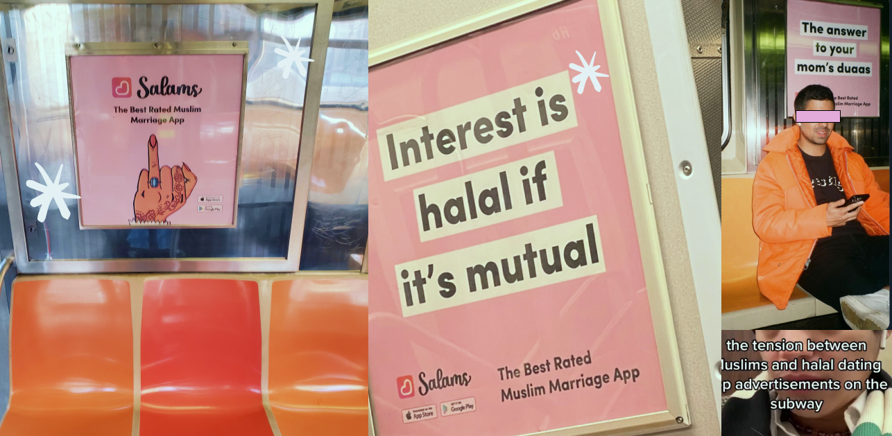
Billboards
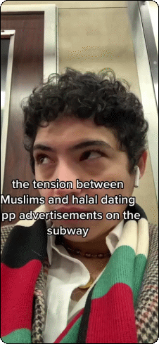
From the New York subway to billboards in Berlin, our refreshed brand didn’t just show up it spoke to our key audience. We leaned into humor that felt true to our community: humorous, warm, and always a little self-aware. Whether it was “Interest is halal if it’s mutual” or “The answer to your mom’s duas,” people noticed shared, laughed, reposted, and most importantly, related.
This wasn’t just about visibility. It was about being memorable in a way that felt culturally grounded, slightly bold, and totally us.


Social Media
On social, our branded videos and graphics reached over 28.4 million impressions, building recognition through storytelling that felt human and heartful.

Events
At our in-person events some with over 10,000 attendees the visuals helped create a welcoming, joyful atmosphere that felt instantly Salams.

Outcomes & Impact
This wasn’t just a visual refresh it became the backbone of how Salams showed up everywhere. I was lucky enough to create a brand system that gave our small team clarity and consistency. Designers, marketers, and even engineers finally had a shared language and toolkit they could lean on.
The new branding rolled out across the product, helped shape core features, and guided how we connected with users both in-app and out in the world. From viral videos that used our visuals (and led to a noticeable increase in in-app purchases), to billboards in New York, London, and Berlin, to IRL events with 10,000+ attendees, our new look didn’t just land it resonated.
We saw 28.4 million impressions on social, a wave of organic engagement, and even a few memes. But most importantly, we finally looked and felt like us.
Key Takeaways & Challenges
One of the most meaningful parts of this project was also the most challenging: being entrusted with a brand that so many people felt deeply connected to. There was a weight to it, in the best way because it meant people cared. As a designer, working across teams meant navigating a lot of opinions, constraints, and fast-moving needs. It pushed me to be flexible, communicative, and intentional in every choice.
I’m so grateful I got to work on something that showed up on billboards, in viral videos, on social feeds, and even in app store screenshots. It’s surreal to see my work out in the world in that way. More than anything, I feel lucky to have been able to put my spin on it to create something that felt honest, uplifting, and uniquely to Salams.