
Design Project
Walgreens Boots Alliance
Project Overview
This was an internal project at Walgreens focused on improving the tools used by pharmacists and pharmacy techs to manage things like shipments, inventory, medication counting, returns, and daily operations. I worked as a UI/Visual Designer, supporting the UX designers and researchers on the team.
A lot of the systems they were using were outdated or clunky, so the goal was to modernize the interface while making it easier to navigate and more efficient for real, everyday workflows. We were designing for devices used behind the pharmacy counter with a big focus on accessibility, clarity, and reducing task friction.
My role was to help bring structure and visual consistency to a pretty complex space. I worked closely with the team to build out UI components, improve hierarchy, and design cleaner layouts that made it easier for pharmacy teams to do their jobs with less stress.
My Role: As a UI/Visual designer I,
Supported UX designers and researchers to create screens for testing
Helped modernize a legacy system used by pharmacists and techs across Walgreens stores
Created UI components and patterns that brought clarity and consistency to complex workflows
Designed clean, accessible layouts for pharmacy facing tasks like inventory, shipments, and medication returns
Worked within internal design systems while advocating for visual improvements to support usability
Collaborated closely with cross-functional partners to align visual direction with pharmacy workflow needs
Team: UX, Product Owners, Business Analysts, and Stakeholders
Tools: Figma, Adobe Illustrator.
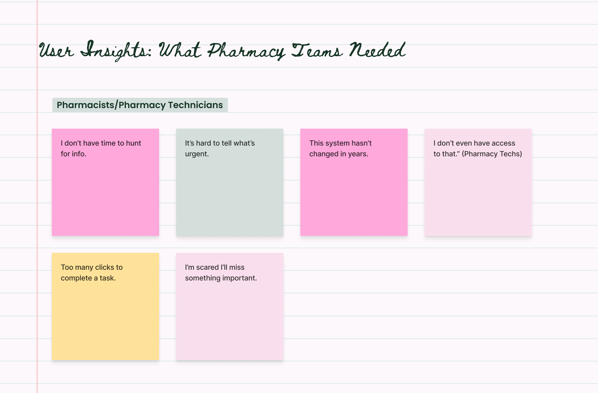
User Insights
Before designing anything, we spent time understanding the people actually using the system, pharmacists and pharmacy techs working long shifts, managing strict workflows, and making fast, high-stakes decisions every day.
Their pain points weren’t about aesthetics, they were about speed, clarity, and avoiding mistakes that could affect patient care. These sticky-note insights reflect some of the most recurring themes we heard and kept returning to throughout the project.
UI Principles I Applied
Created clean, reusable UI components for devs to work with across multiple pharmacy tools
Designed custom icons for specific use cases like Controlled Substances (CII, CIII) to make high-risk meds instantly recognizable
Spent a lot of time on text hierarchy knowing pharmacists and techs often have seconds to scan and act
Focused on what needs to stand out in the moment: urgent tasks, errors, incomplete orders
Built error and urgency states because missing a warning or delay could directly impact patient care
As a hands on designer in the trenches, my job was making sure every screen was consistent, accessible, and ready to ship within a huge system of designers and researchers and for them as well. My goal was to learn and then to support the bigger vision through thoughtful, detail-oriented work that could quietly but meaningfully improve how the product worked and ultimately, how it impacted the business.
Working together = Success
Challenges & Takeaways
One of the biggest challenges was working within a massive system where every decision had layers of technical, legal, and operational weight behind it. The pharmacy space is fast-paced, high-stakes, and filled with constraints, and that meant design had to be intentional with every visual choice.
It also meant learning how to collaborate deeply with researchers, product owners, engineers, and other designers all moving toward the same goal. Design here wasn’t about standing out, it was about supporting getting the details right so others could build confidently.
I learned how to design for speed, clarity, and real-world pressure. And more than anything, it reinforced something I’ll always carry: good design is quiet, collaborative, and rarely done alone.